Material Design为UI设计提供了许多准则,保证统一的视觉效果和合理的交互。
比较明显的是:
通过高度描述层次
通过阴影表达高度
通过动画引起关注
假如有了Material风格的设计稿,怎样在Android里实现呢?
1. Android 4.X或以下版本
1.1 主题、布局、配色
一直都有,改配置即可
1.2 全屏扩散的水波纹触摸反馈
如果非要做,我猜可以这样:在根布局上再加一层,经过一堆坐标转换和裁切,把动画绘制在那个层,但工作量、性能和体验都可想而知。
1.3 共享元素转换动画
如果不是真爱,我会跟设计师协商换方案……
Activity基本不能直接用了,需要用Fragment重写,自己管理Fragment的生命周期,控制窗口事件,控制转场动画,光想想都觉得很蛋疼。
1.4 阴影
每个程序员应该都会对阴影深恶痛绝,因为阴影很难处理。可是设计师不知道啊,在扁平风没流行的时候,设计师们恨不得给每个浮起的部件都加上阴影,结果阴影成了程序员的阴影,成了各种geek方案的实验田。
在Android 4.X或更低版本的系统里,一个View如果要显示阴影,通常是通过nine-patch背景图实现的,所以View的尺寸会包含阴影的部分,于是便带来各种计算问题:
1.4.1 如何确定View的尺寸?
尺寸问题大多可以用土方法解决:
- 如果View固定长宽,测量完尺寸后,额外加上阴影的尺寸
- 为mdpi/hdpi/xhdpi/xxhdpi指定不同阴影尺寸的nine-patch图片
- 定义shadowLeft/shadowRight/shadowTop/shadowBottom之类参数辅助计算
1.4.2 如何定位?
定位问题处理起来非常麻烦。
例如一个很简单的界面,ActionBar下面一个全屏的ScrollView。 从布局来看,外层应该是个垂直的LinearLayout,一个ActionBar,一个ScrollView搞定。
可是Material风格的ActionBar下面是有个半透明阴影的,阴影和ScrollView的是部分重合的!
噩梦开始了,先把LinearLayout改成ReleativeLayout,ActionBar指定高度为actionBarHeight+shadowBottom,ScrollView指定topMargin为actionBarHeight。当然还有其他的方法,例如把阴影单独切图做成个View跟ScrollView重叠放置。
1.4.3 高度变化时阴影尺寸怎么改变?
几乎无法实现,除非恶劣地提供一系列不同阴影尺寸的背景图……
1.4.4 列表的dividerHeight如果大于0小于shadowBottom怎么办?
定义个垂直方向裁切过的Drawable作为divider,底部可能还要补一个完整高度的阴影,如果每项的底色是透明的还要补个被遮盖的部分阴影……
1.4.5 问题根源在哪?
根据Material风格的定义,高度是View的基本属性,阴影属于环境,应该由环境结合View的高度进行渲染。
用背景图来实现阴影,视图模型就跟设计稿不一致,任何补救都是拆东墙补西墙。
2. Android 5.x或以上版本
有了API21和v7兼容包,上面的那堆问题终于不是问题了!
官方文档: How to implement material design on Android
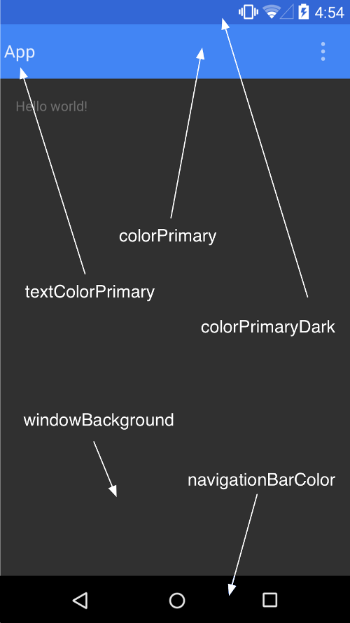
2.1 Material主题
官方提供深色版主题(Theme.Material)和浅色版主题(Theme.Material.Light)
可以自定义主题色和强调色:
1 2 3 4 5 6 7 8 9 10 11
| <resources> <style name="AppTheme" parent="android:Theme.Material"> <item name="android:colorPrimary">@color/primary</item> <item name="android:colorPrimaryDark">@color/primary_dark</item> <item name="android:colorAccent">@color/accent</item> </style> </resources>
|
状态栏颜色由statusBarColor决定,默认将继承colorPrimaryDark的值,可设置为@android:color/transparent使之透明。
2.2 RecyclerView
1 2 3
| dependencies { compile 'com.android.support:recyclerview-v7:21.0.+' }
|
内置的布局管理器包括:
LinearLayoutManager: 以垂直或水平滚动列表方式显示项目
GridLayoutManager: 在网格中显示项目
StaggeredGridLayoutManager: 在分散对齐网格中显示项目
RecyclerView添加与删除项目时有默认动画,可通过setItemAnimator()自定义动画
2.3 CardView
1 2 3
| dependencies { compile 'com.android.support:cardview-v7:21.0.+' }
|
包含以下属性/方法:
2.4 阴影
Z = elevation + translationZ,单位dp
2.4.1 静止高度 elevation
1 2 3 4 5 6 7
| <TextView android:id="@+id/my_textview" android:layout_width="wrap_content" android:layout_height="wrap_content" android:text="@string/next" android:background="@color/white" android:elevation="5dp" />
|
2.4.2 高度偏移 translationZ
使用 ViewPropertyAnimator.z() 和 ViewPropertyAnimator.translationZ() 可创建视图高度动画
2.4.3 轮廓 Outline
视图将投射一个带有圆角的阴影,轮廓则用于渲染阴影。
默认情况下轮廓是背景的形状,使用View.setOutlineProvider()可自定义轮廓,如果希望禁止阴影,可以设为null。
2.5 裁剪
2.6 图片
2.6.1 着色
通过tint/tintMode可为BitmapDrawable/NinePatchDrawable着色。
2.6.2 萃取颜色
1 2 3
| dependencies { compile 'com.android.support:palette-v7:21.0.0' }
|
Palette类可从图像萃取下列突出颜色:
- 鲜艳 Vibrant
- 鲜艳深色 Vibrant Dark
- 鲜艳浅色 Vibrant Light
- 低调 Muted
- 低调深色 Muted Dark
- 低调浅色 Muted Light
1 2 3 4 5 6 7 8 9
| Palette p = Palette.from(bitmap).generate(); Palette.from(bitmap).generate(new PaletteAsyncListener() { public void onGenerated(Palette p) { } });
|
2.6.3 矢量图片
可使用vector和SVG语法描述矢量图:
1 2 3 4 5 6 7 8 9 10 11 12 13 14 15 16 17 18 19
| <!-- res/drawable/heart.xml --> <vector xmlns:android="http://schemas.android.com/apk/res/android" <!-- intrinsic size of the drawable --> android:height="256dp" android:width="256dp" <!-- size of the virtual canvas --> android:viewportWidth="32" android:viewportHeight="32"> <!-- draw a path --> <path android:fillColor="#8fff" android:pathData="M20.5,9.5 c-1.955,0,-3.83,1.268,-4.5,3 c-0.67,-1.732,-2.547,-3,-4.5,-3 C8.957,9.5,7,11.432,7,14 c0,3.53,3.793,6.257,9,11.5 c5.207,-5.242,9,-7.97,9,-11.5 C25,11.432,23.043,9.5,20.5,9.5z" /> </vector>
|
2.7 动画
2.7.1 触摸反馈
使用ripple/RippleDrawable实现水波纹效果
- ?android:attr/selectableItemBackground 指定有界的波纹。
- ?android:attr/selectableItemBackgroundBorderless 指定无界的波纹
- ?android:colorControlHighlight 指定默认触摸反馈颜色
2.7.2 揭露效果 (reveal)
用于显示或隐藏一组UI元素。ViewAnimationUtils.createCircularReveal()能够为裁剪区域添加动画以揭露或隐藏视图。
1 2 3 4 5 6 7 8 9 10 11 12 13 14 15 16 17 18 19 20 21 22 23 24 25 26 27
| View myView = findViewById(R.id.my_view); int cx = (myView.getLeft() + myView.getRight()) / 2; int cy = (myView.getTop() + myView.getBottom()) / 2; int initialRadius = 0; int finalRadius = Math.max(myView.getWidth(), myView.getHeight()); Animator anim = ViewAnimationUtils.createCircularReveal(myView, cx, cy, initialRadius, finalRadius); myView.setVisibility(View.VISIBLE); anim.start(); int initialRadius = myView.getWidth(); int finalRadius = 0; Animator anim = ViewAnimationUtils.createCircularReveal(myView, cx, cy, initialRadius, finalRadius); anim.addListener(new AnimatorListenerAdapter() { @Override public void onAnimationEnd(Animator animation) { super.onAnimationEnd(animation); myView.setVisibility(View.INVISIBLE); } }); anim.start();
|
2.7.3 转换
转换继承自android.transition.Visibility,默认转换是淡入淡出
- 分解 Explode
- 滑动 Slide
- 淡入淡出 Fade
示例:
1 2 3 4 5 6 7 8 9 10 11 12 13 14 15 16 17 18 19 20 21 22 23 24 25 26
| <style name="BaseAppTheme" parent="android:Theme.Material"> <item name="android:windowContentTransitions">true</item> <item name="android:windowEnterTransition">@transition/explode</item> <item name="android:windowExitTransition">@transition/explode</item> <item name="android:windowSharedElementEnterTransition"> @transition/change_image_transform</item> <item name="android:windowSharedElementExitTransition"> @transition/change_image_transform</item> </style> <transitionSet xmlns:android="http://schemas.android.com/apk/res/android" android:transitionOrdering="sequential"> <changeBounds/> <fade android:fadingMode="fade_out" > <targets> <target android:targetId="@id/grayscaleContainer" /> </targets> </fade> </transitionSet> <transition class="my.app.transition.CustomTransition"/>
|
1 2 3 4 5 6 7 8 9 10 11 12 13 14 15
| public class MyActivity extends Activity { @Override protected void onCreate(Bundle savedInstanceState) { super.onCreate(savedInstanceState); getWindow().requestFeature(Window.FEATURE_CONTENT_TRANSITIONS); setContentView(R.layout.activity_my); } public void onSomeButtonClicked(View view) { getWindow().setExitTransition(new Explode()); Intent intent = new Intent(this, MyOtherActivity.class); startActivity(intent, ActivityOptions.makeSceneTransitionAnimation(this).toBundle()); } }
|
2.7.4 共享元素转换
共享元素转换继承自android.transition.Transition
- changeBounds
- changeClipBounds
- changeTransform
- changeImageTransform
以共享元素启动一个操作行为
- 在主题中启用窗口内容转换
- 在风格中指定一个共享元素转换
- 将您的转换定义为 XML 资源
- 指定共享元素通用名称 android:transitionName/View.setTransitionName()
- 使用 ActivityOptions.makeSceneTransitionAnimation()
1 2 3 4 5 6 7 8 9 10 11
| View androidRobotView = findViewById(R.id.image_small); ActivityOptions options = ActivityOptions .makeSceneTransitionAnimation(this, androidRobotView, "robot"); startActivity(new Intent(this, Activity2.class), options.toBundle());
|
2.7.5 曲线运动
PathInterpolator可基于贝塞尔曲线或Path
1 2 3 4 5
| <pathInterpolator xmlns:android="http://schemas.android.com/apk/res/android" android:controlX1="0.4" android:controlY1="0" android:controlX2="1" android:controlY2="1"/>
|
系统提供了三种基本曲线:
@interpolator/fast_out_linear_in.xml
@interpolator/fast_out_slow_in.xml
@interpolator/linear_out_slow_in.xml
可通过ObjectAnimator的新构造函数添加路径动画
1 2 3 4
| ObjectAnimator mAnimator; mAnimator = ObjectAnimator.ofFloat(view, View.X, View.Y, path); ... mAnimator.start();
|
2.7.6 状态动画
通过android:stateListAnimator可以为View指定状态动画(神一般的功能,再也不用写视图状态机了)。
1 2 3 4 5 6 7 8 9 10 11 12 13 14 15 16 17 18 19 20 21 22 23
| <selector xmlns:android="http://schemas.android.com/apk/res/android"> <item android:state_pressed="true"> <set> <objectAnimator android:propertyName="translationZ" android:duration="@android:integer/config_shortAnimTime" android:valueTo="2dp" android:valueType="floatType"/> here for "x" and "y", or other properties --> </set> </item> <item android:state_enabled="true" android:state_pressed="false" android:state_focused="true"> <set> <objectAnimator android:propertyName="translationZ" android:duration="100" android:valueTo="0" android:valueType="floatType"/> </set> </item> </selector>
|
Material主题的按钮默认情况下包含Z动画,可将stateListAnimator设为@null以避免这种行为。
还可通过animated-selector/AnimatedStateListDrawable用图片表示View的不同状态:
1 2 3 4 5 6 7 8 9 10 11 12 13 14 15 16 17 18 19 20 21 22
| <!-- res/drawable/myanimstatedrawable.xml --> <animated-selector xmlns:android="http://schemas.android.com/apk/res/android"> <!-- provide a different drawable for each state--> <item android:id="@+id/pressed" android:drawable="@drawable/drawableP" android:state_pressed="true"/> <item android:id="@+id/focused" android:drawable="@drawable/drawableF" android:state_focused="true"/> <item android:id="@id/default" android:drawable="@drawable/drawableD"/> <!-- specify a transition --> <transition android:fromId="@+id/default" android:toId="@+id/pressed"> <animation-list> <item android:duration="15" android:drawable="@drawable/dt1"/> <item android:duration="15" android:drawable="@drawable/dt2"/> ... </animation-list> </transition> ... </animated-selector>
|
2.7.7 矢量动画
1 2 3 4 5 6 7 8 9 10 11 12 13 14 15 16 17 18 19 20 21 22 23 24 25 26 27 28 29 30 31 32 33 34 35 36 37 38 39 40 41 42
| <vector xmlns:android="http://schemas.android.com/apk/res/android" android:height="64dp" android:width="64dp" android:viewportHeight="600" android:viewportWidth="600"> <group android:name="rotationGroup" android:pivotX="300.0" android:pivotY="300.0" android:rotation="45.0" > <path android:name="v" android:fillColor="#000000" android:pathData="M300,70 l 0,-70 70,70 0,0 -70,70z" /> </group> </vector> <objectAnimator android:duration="6000" android:propertyName="rotation" android:valueFrom="0" android:valueTo="360" /> <set xmlns:android="http://schemas.android.com/apk/res/android"> <objectAnimator android:duration="3000" android:propertyName="pathData" android:valueFrom="M300,70 l 0,-70 70,70 0,0 -70,70z" android:valueTo="M300,70 l 0,-70 70,0 0,140 -70,0 z" android:valueType="pathType" /> </set> <animated-vector xmlns:android="http://schemas.android.com/apk/res/android" android:drawable="@drawable/vectordrawable" > <target android:name="rotationGroup" android:animation="@anim/rotation" /> <target android:name="v" android:animation="@anim/path_morph" /> </animated-vector>
|
2.8 兼容性
下列功能仅在 Android 5.0(API21)及更高版本中提供:
- 操作行为转换
- 触摸反馈
- 揭露动画
- 基于路径的动画
- 矢量图片
- 图片着色
v7r21兼容库包括以下功能:
2.8.1 为下列组件提供Material风格主题
- EditText
- Spinner
- CheckBox
- RadioButton
- SwitchCompat
- CheckedTextView
2.8.2 配色
1 2 3 4 5 6 7
| <!-- extend one of the Theme.AppCompat themes --> <style name="Theme.MyTheme" parent="Theme.AppCompat.Light"> <!-- customize the color palette --> <item name="colorPrimary">@color/material_blue_500</item> <item name="colorPrimaryDark">@color/material_blue_700</item> <item name="colorAccent">@color/material_green_A200</item> </style>
|
2.8.3 RecyclerView和CardView
1 2 3 4 5
| dependencies { compile 'com.android.support:appcompat-v7:21.0.+' compile 'com.android.support:cardview-v7:21.0.+' compile 'com.android.support:recyclerview-v7:21.0.+' }
|
但早期版本会有下面的限制:
CardView使用额外边距返回编程阴影实现
CardView不会裁剪其与圆角相交的子视图
2.8.4 Palette